25th July 2026

When the North East finally begins to soften after winter, the change in light is unmistakable. Rooms that felt cosy in January can suddenly feel heavy by March. And that’s where colour becomes transformative.
If you’ve been searching for inspiration around spring colour palettes in Newcastle or wondering how to update your home without a full renovation, this guide will help you choose tones that feel fresh, elevated and beautifully considered.
Whether you live in a Georgian townhouse in Newcastle city centre, a modern new build in Gosforth, or a countryside home in Northumberland, spring colour is about optimism, clarity and light.
Homes across Newcastle and Northumberland experience dramatic seasonal light shifts. Winter light is low, cool and short lived. Spring light is brighter, clearer and more directional which means colours behave differently.
A shade that felt rich and comforting in December may now appear muddy or flat.
Choosing the right spring palette isn’t about following trends blindly. It’s about understanding:
Natural light direction
Ceiling height
Architectural style
Existing flooring and joinery
How you want the space to feel
This is why working with an experienced interior designer in Newcastle can make such a difference as colour is science as much as style.
Green remains one of the strongest interior design trends in the UK and for good reason.
Sage, eucalyptus and olive tones:
Reflect Northumberland’s landscape
Feel calming and restorative
Pair beautifully with oak flooring
Work in both period and modern homes
In spring, we lean towards muted, grey based greens rather than deep forest shades. These lighter variations lift walls without overwhelming them.
Perfect for:
Living rooms
Kitchens
Garden facing spaces
Bedrooms needing calm
Pair with: warm white, brushed brass, linen textures and natural woods.
Cool grey dominated UK interiors for years. Spring 2026 continues the shift toward warmer, earthier neutrals.
Think:
Oatmeal
Mushroom
Putty
Warm ivory
Soft clay
These tones create brightness without feeling stark which is ideal for Newcastle homes that need warmth during transitional months.
They also create the perfect backdrop for layering colour through accessories.
If you’re updating a Northumberland property with traditional features, warm neutrals highlight cornicing and panelling beautifully.
For homes near Tynemouth, Whitley Bay or the Northumberland coast, spring is the moment to lean into coastal influence, but subtly.
Avoid overly nautical themes. Instead choose:
Powder blue
Washed denim
Pale teal
Seafoam
These colours reflect open skies and sea horizons, instantly making rooms feel larger and lighter.
Best used in:
Bedrooms
Bathrooms
Hallways
Snugs
Pair with natural linen, pale wood and textured ceramics for a sophisticated finish.
Pink in 2026 isn’t sugary, it’s grown-up and grounded.
Blush with earthy undertones or dusty terracotta:
Add warmth without heaviness
Work beautifully in north facing rooms
Complement heritage properties
In Newcastle’s Victorian terraces, muted pinks look exceptional against original fireplaces and ceiling roses.
Layer with: cream upholstery, walnut furniture and soft gold accents.
Yellow is quietly making a comeback – especially soft, buttery versions rather than bright primary tones.
Used thoughtfully, yellow:
Mimics spring sunlight
Lifts darker rooms
Adds subtle energy
Ideal for:
Dining rooms
Kitchens
Accent walls
It pairs beautifully with sage green and warm white for a modern countryside aesthetic – perfect for homes across Ponteland and rural Northumberland.
You don’t always need a decorator.
Try:
Swapping cushion covers
Adding new artwork
Updating table lamps
Replacing bed linen
Styling shelves with coloured ceramics
Many clients searching for interior design in Newcastle initially assume they need major work but often, targeted colour updates create dramatic impact.
Living Room:
Soft green, warm neutral base, pastel accents.
Kitchen:
Botanical tones, muted terracotta, natural wood.
Bedroom:
Sky blue, blush, creamy ivory.
Hallway:
Light reflective neutrals to maximise brightness.
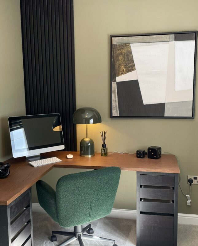
Home Office:
Sage or dusty blue for focus without heaviness.
Even experienced homeowners make these errors:
• Choosing colours from tiny swatches
• Ignoring lighting direction
• Using cool whites with warm palettes
• Following trends without considering architecture
• Forgetting flow between rooms
Spring palettes should feel cohesive throughout the house – not like disconnected seasonal experiments.
Interior design in Newcastle and Northumberland is unique because of:
Period architecture
Coastal influences
Changing daylight
New build developments with standard ceiling heights
A colour that works in London won’t necessarily translate here.
Understanding how natural light behaves in North East homes is essential for achieving that elevated, designer finish.
Spring is an opportunity not just to decorate, but to reset the mood of your home.
The right colour palette:
Enhances natural light
Reflects your lifestyle
Adds value
Creates emotional comfort
If you’re ready to refresh your space and want expert guidance on choosing the perfect spring colour palette for your Newcastle or Northumberland home, now is the ideal time to begin planning.
A carefully curated scheme will carry you beautifully through summer and beyond.
Contact us here to start the journey with us!