25th July 2026

Welcome to Part 1 of our 2025 Interior Colour Trends Report — and we’re starting with the star of every space: colour.
This year, colour is all about comfort, mood, and meaning. Forget cold minimalism. 2025 is ushering in warmth, personality, and rich tonal palettes that connect us to nature and heritage. Whether you’re refreshing one room or designing an entire home, here are the shades that will define the year ahead — and how to style them like a designer.
Warm, sunbaked hues are everywhere this year. Think terracotta, soft paprika, and dusty peach. These earthy tones bring instant warmth and make even minimal spaces feel inviting.
How to use them:
Use these tones as wall colours in bedrooms or living spaces for a cocooning effect, or introduce them through upholstery, textured cushions, or statement ceramics.
Designer tip: Pair with off-white and muted sage for a grounded, natural palette.
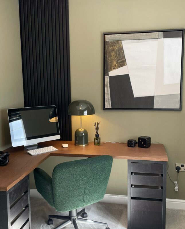
Green continues its reign, but with a more mature twist. We’re seeing less vibrant emerald and more muted olives, moss, and eucalyptus.
How to use them:
Perfect for kitchens, pantries, or home offices — olive greens feel timeless and layered. They work beautifully with warm woods, brushed brass, and natural stone.
Designer tip: Use tonal greens across soft furnishings and wall paint for a soothing, tonal look that doesn’t feel too “matchy.”
Dark, inky colours are making a comeback — not in a dramatic way, but as grounding elements. Navy, slate and midnight blues bring sophistication to neutral spaces.
How to use them:
Accent walls, cabinetry, or built-in shelving. These shades add depth without feeling cold.
Designer tip: Break up darker tones with antique brass or smoked glass for a luxe, layered finish.
Forget the beige of early 2000s showhomes. This year’s neutrals are warmer, deeper, and more tactile. From oatmeal and taupe to mushroom and flint, these neutrals feel grounded, not bland.
How to use them:
Perfect as base tones throughout the home — walls, large sofas, rugs — then layered with texture, greenery, and accent colour.
Designer tip: These tones work beautifully in north-facing rooms that need extra warmth.
Want a little fun? 2025 is also seeing micro-trends of soft, joyful pops — not overpowering, but thoughtfully placed.
How to use them:
Cushions, lampshades, occasional chairs or art. These tones aren’t the main act, but they add just enough vibrancy to elevate a muted scheme.
Designer tip: Pair one bold pop with an otherwise earthy palette for balance.
Q Interiors Tip: Not sure which trend suits your space? Our downloadable Virtual Moodboard Kits (coming soon!) include curated colour palettes with product inspiration, making it easy to visualise your space before you buy.
Q Interiors – one of the leading interior designers in the Newcastle, Northumberland, Tyne & Wear and County Durham areas. Contact us for more information on our services and visit our new shop for some inspiration!